Comparing BTC 2014 Bubble to ETH 2018 Bubble
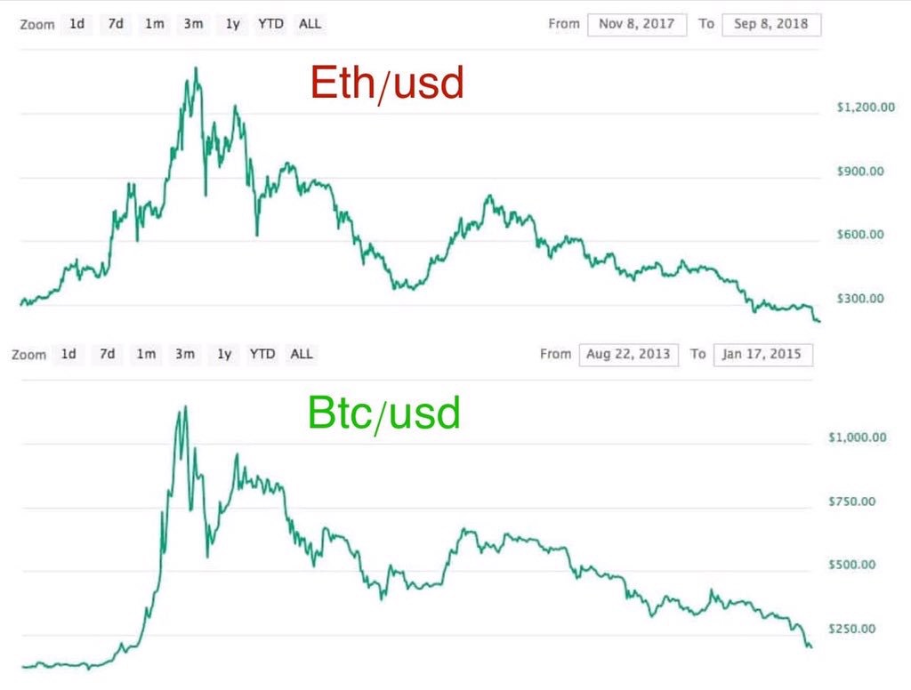
Check out this image comparing the BTC 2013 – 2015 bubble to the ETH 2017 – 2018 bubble. Looks uncanny.
In some ideal future maybe ETH goes to $19k like BTC did. Sure, you could argue ETH has a higher supply. That said… what does that have to do with recognizing a chart pattern?
I would be more interested to know if this was signaling we are near a bottom (not maybe an exact bottom, but a range that potentially stretches out), not because of any fundamentals, but because of human nature in a speculative crypto market and the patterns that result.

NOTE: Image comes from someone’s tweet, can remember who. Feel free to ask for credit. Honestly though it is just screen grabs of Coin Market Cap. 🙂
Author: Thomas DeMichele
Thomas DeMichele has been working in the cryptocurrency information space since 2015 when CryptocurrencyFacts.com was created. He has contributed to MakerDAO, Alpha Bot (the number one crypto bot on Discord),...
Thomas DeMichele's Full Bio