BTC 2013 – 2019 and Beyond With Fib Levels
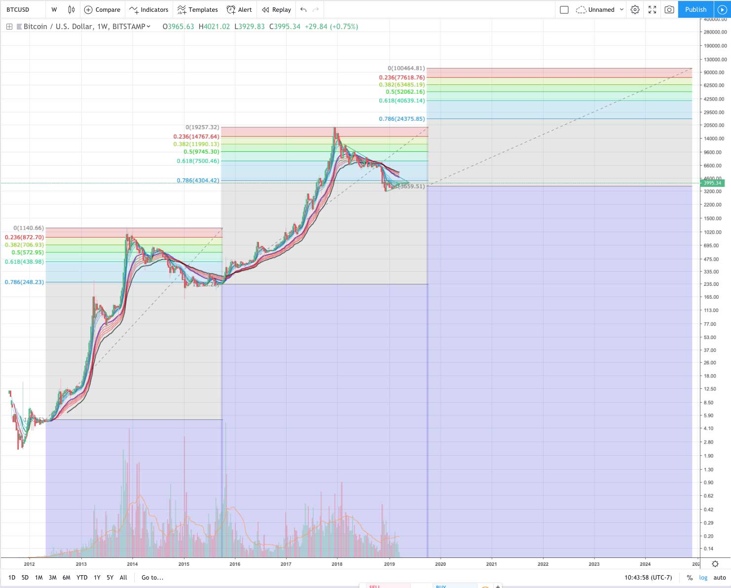
This chart looks at BTC from 2013 – 2019 and beyond using fib levels. You can see the 2013 market cycle looks a lot like the 2017. Does that pattern repeat?
One note I would make here is that it would for me be very reasonable to see 2013 – 2015 and 2016 – 2019 market cycles as fractals, and in seeing this ignore the fact that there was this pump in 2014 but a long flat period in 2018. Instead, I’d look at the shapes much more roughly and conclude that 2019 has now bottomed essentially bottomed at the .786 just like it did in 2015.
In other words, what if the red boxes below are equivalent parts in the cycle, and what happens in them specifically should be ignored when trying to use 2014 – 2015 to tell us something about the current cycle.

What if many have this wrong and these two boxes are actually equivalent.

Other than that, I don’t really have much to say that the image doesn’t say itself other than that “this is a rough draft idea and not a trading strategy with targets.”
So this is sort of a “what if” and a “hmmm, can see one way it gets to $100k” and not a “on June 10th at 9:34 pm the price will be X so go long Z amount in P coin.”
Honestly, I am not personally trading crypto like the bottom is in, and even if I was it wouldn’t be based on this one chart idea.
That said, ?
Author: Thomas DeMichele
Thomas DeMichele has been working in the cryptocurrency information space since 2015 when CryptocurrencyFacts.com was created. He has contributed to MakerDAO, Alpha Bot (the number one crypto bot on Discord),...
Thomas DeMichele's Full Bio