The Decline in the Total Market Cap of Crypto in 2018 is Worse Than 2014
The decline in the total market cap of all crypto in 2018 from peak to low is actually bigger than in 2014. Not just in dollar amount, but in the percentage dropped.
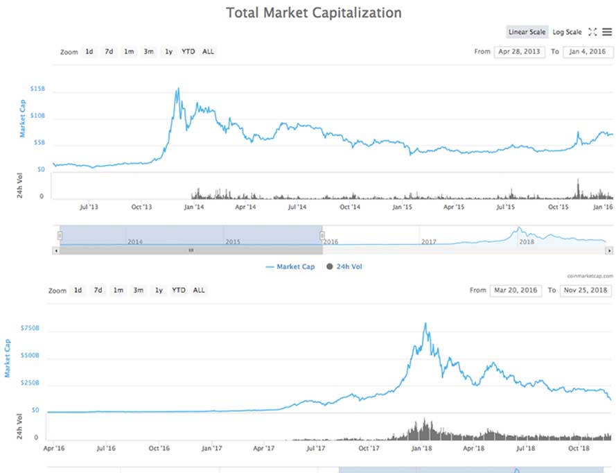
- 2018: A decline from roughly $820 billion to $120 billion (roughly 1/7th of the cap at the high… so far).
- 2014: A decline from roughly $15 billion to $3 billion (roughly 1/5th of the cap at the at the high).
Visually on the chart above you can see that the market cap never came close to touching previous levels from 2013 (roughly $1 billion to $1.5 billion). In fact, it bottomed at Nov 2013 levels.
Meanwhile in 2018, we are back at August 2017 levels already… and no one knows how much further it’ll go.

I am not 100% sure what to make of the data, but one notable difference is ICOs.
Although in late 2013 there were many alts with record high market caps that went on to lose 90%+ of their value just like in 2018, there wasn’t the sheer number of new coins popping up in those days.
Meanwhile, in late 2017 and early 2018 there were a ton of new coins from ICOs with record high market caps.
Consider, there were 485 coins on coinmarketcap by the bottom of the 2013 – 2015 bubble, and there are currently over 2,072 here on Nov 27 2018.
So there is some logic in this decline being bigger. Consider, if you have more random alts “mooning” that really didn’t merit the increase, you are going to see a bigger decline in total cap on the other side of the bubble.
Think of it this way, if there were only two coins, BTC and ETH, and the BTC cap dropped 80% and the ETH cap 90%, the total cap would have dropped 85%.
However, if we add in 100 tokens that all dropped 99%, then the total cap could drop close to 99% (the other coins pull the average down by the force of sheer numbers).
That said, the above is pure speculation. It sort of makes sense, but it is a theory based on the idea that a greater percentage of 2017 – 2018 coins were of a lower quality than in 2013 – 2015… and I am not so sure that is really the case to the extent that explains the difference in the patterns.
Lastly, we have one additional problem here with analyzing the market cap… that is, I can’t find data from before April 2013… so I can’t for example compare the patterns from earlier years.
The less instances of events we have to look at, the less likely similarities and differences between sets of events will tell us anything useful.
Anyway, point here is the same. There is no point really. I’m just pointing out the similarities and differences in the market caps from two periods and offering some thoughts. Make of that what you will 😀
Author: Thomas DeMichele
Thomas DeMichele has been working in the cryptocurrency information space since 2015 when CryptocurrencyFacts.com was created. He has contributed to MakerDAO, Alpha Bot (the number one crypto bot on Discord),...
Thomas DeMichele's Full Bio