Bitcoin’s 2014 Bubble and 2018 Bubble Compared (As of November 2018)
Here is Bitcoin’s 2018 bubble overlaid on top of the 2014 bubble. Below you’ll find a chart that looks at the crypto market caps from this time period as well.
As you can see the drop from the peak to the current low are nearing equivalence at this point. Fortunately or unfortunately depending on your viewpoint, that doesn’t necessarily say anything about the future.
TIP: In the chart above, the one that is faded with the dots is 2018. If it is giving you a headache, go to BTC/USD on Bitstamp on TradingView and look at these chunks separately.

NOTE: In the chart below I’ve overlaid BTC 2014 – 2016 on a BTC 2013 – 2021 chart. In other words, if BTC 2018 – 2021 repeated the pattern from 2014 – 2016, it might look something like this. Clearly that doesn’t have to happen, the idea here is only to show that this was the end result during the last bubble.

If BTC 2018 – 2021 repeated the pattern from 2014 – 2016, it might look something like this.
Analysis
Although comparing these two charts doesn’t tell us anything about the future for sure, it might be interesting to some (like me) to compare the two charts for educational and entertainment purposes.
Here are some of the notable similarities I see between the two bubbles.
- In each case Bitcoin went up at the end of the previous year and then dropped throughout the entire year (as of Nov 25, 2018 that is true for this bubble).
- The current price and volume action in 2018 looks like a form of capitulation (if we accept that capitulation doesn’t just happen once at the bottom and isn’t strictly just a phase on a market cycle chart). There were only a few points on the 2014 chart that looked like capitulation, one at the bottom at $150 in Jan 2015, one at about $300 in Oct 2014, one at about $450 in Aug 2014, one at about $350 in April 2014, and one at about $400 in Feb 2014.
- With the above in mind, volume declined in BTC in 2014 all the way until August 2014 and it didn’t really match previous levels until Oct 2014.
- Further, while one could argue 2018 is moving much slower than 2018, there are chart patterns hinting that this is not in fact the case. One thing to note is the price action after the high formed a triangle type shape in both 2014 and 2018. In 2014 the triangle breaks down in October. In 2018 the triangle broke down this month, in November. That is only a one month difference.
- Now lets look at horizontal support. In 2014 the rise was so quick that there wasn’t much horizontal support. Major support was from the first bubble of 2013, and interestingly enough the 2014 bubble held at that support. In 2018 the rise was more gradual, so there are more major horizontal supports to consider. One was at $6k-ish (where we consolidated for most of the year), one was at $3.5k to $4.5k-ish (we are at the bottom of that one now), one is at $2.5k-ish, and one is at the top of the 2014 bubble around $1.2k . Below that is the range in which BTC traded before the rise in 2015 – 2016 (anywhere between $150 – $800 let’s say). You’ll notice that while I could put these numbers on a dart board, pick one, and then pray I look smart in retrospect… there is an element of guessing and gambling in doing something like that. These are all simply places the chart points to and can be spotted by eye or with basic TA. Let’s not view them as places to buy or sell, but rather places to watch when comparing 2018 and 2014.
- Lastly, look below. Here is the 2014 market cap of all coins vs. the 2018 market cap of all coins. You can see we are still in a downtrend, but you can also see a general similarity between the two chart patterns.

Market cap 2014 to 2018.
Conclusion
If things were to repeat perfectly, we might say this spot in 2018 is roughly equivalent to Oct 2014 or Jan 2015.
The triangle has broken down, volume has just started to come back by way of large red candles (one might argue these are capitulation candles), roughly a year has passed, we are starting to hit major supports from before the parabolic rise, we are approaching the top of the last bubble, and both the BTC and altcoin chart look more like Oct – Jan than they do the bit before that.
Of course the problems with that takeaway are many in practice and in theory. For example, in Oct of 2014 there was still another 50% decline to come, the top of the last bubble is more than 50% below the current price, and guess what… there is no rule that says Bitcoin has to stop going down or ever come back or that patterns have to repeat.
Yes, so far 2014 and 2018 have looked like self similar fractals where the main difference is found in minutia like “in 2014 there was a longer post tax day rally.” However, similarities so far don’t tell us anything about the future for sure.
The reality is the bears could short this thing to zero. In the past those who stuck with Bitcoin and averaged down were rewarded with alts seasons followed by epic gains in the coins that stuck around, but maybe this generation is only rewarded with gloating Jamie Dimons and I told you so’s.
Point being, yay educational Bitcoin charts, but if you want to know what I think about catching falling knives, see an article on how to conservatively prepare for the worst and/or position sizing and risk management.
NOTE: See those major horizontal supports below $100? There is no rule that says we can’t head there. Do you have a plan for what happens if we do?

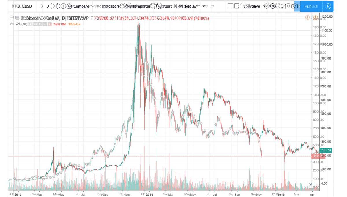
Bitcoin since 2012 with some chart patterns and trend lines illustrated.
Author: Thomas DeMichele
Thomas DeMichele has been working in the cryptocurrency information space since 2015 when CryptocurrencyFacts.com was created. He has contributed to MakerDAO, Alpha Bot (the number one crypto bot on Discord),...
Thomas DeMichele's Full Bio