Comparing Bitcoin’s 2014 Chart to 2018
Comparing Bitcoin’s 2014 and 2018 Price Chart for Educational Purposes
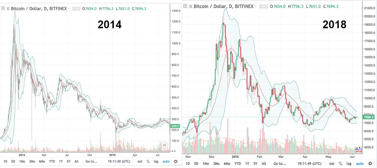
I personally think Bitcoin’s 2014 price chart is worth comparing to the current 2018 chart, as there are many similarities. Here are some thoughts on the comparison.
Semantics: This page compares the 2013 – 2015 Bitcoin chart (calling it the “2014” bubble) and the 2016 – 2018 and potentially beyond Bitcoin chart (calling it the “2018” bubble).
UPDATE: See the charts below for some current charts (from Nov 2018 – June 2019 to keep the page relevant). The first one shows the latest chart of Bitcoin since it started trading (so BTC 2010 – 2019). The next, created early in 2019, shows how we could have found a bottom in 2019 and could see another market cycle in the coming years. The Second one is a clean chart shows the 2014 bubble from the start of the parabolic rise in 2012, all the way to the top, and then back down again and compares that to the 2016 – 2018 equivalent. The next chart spans 2012 to 2018 and illustrates some trend lines, similar patterns, and horizontal support zones. The next compares the 2014 and 2018 bubbles using an overlay. Lastly, you’ll find the market caps of 2014 and 2018 compared. See an updated look at 2014 vs. 2018.

Bitcoin from 2010 – 2019. So you can compared 2014 – 2015 to 2019.

BTC 2013 – 2019 and beyond with Fib levels.

At this point BTC’s 2018 bubble looks a lot like the 2014 bubble. Will it be worse or will history repeat?

Bitcoin since 2012 with some chart patterns and trend lines illustrated.

Bitcoin 2014 vs. 2018 from the vantage point of Nov 2018.

Market cap 2014 to 2018.
Framing the Analysis

First, there are generally two camps. One camp says you can and should compare the two charts, as there have been so many parallels thus far. The other camp says it is pointless. I am in the first camp. Both are valid positions.
Second, this isn’t investing advice. This is educational at best, if not just somewhere between entertainment and philosophy.
Third, any specific price I note below is meant as a way to help explain points on a chart, not as a price target. Even if the pattern repeats one should expect slight variations and will have to treat the present as a unique event from the past (exact price targets aren’t my business… and are in my opinion always unrealistic; in my opinion its always better to average in and out of positions).
Moving on, let me explain the chart at the top of the screen a bit before we get started so we are on the same page.
- The image at the top of the screen shows the late 2013 – August 2015 chart (the “2014” chart) on the left and late 2017 – June 2018 chart (the “2018” chart) on the right. NOTE: There is a years long rally after the end of the “2014” chart. That chart illustrates the $150 – $200 bottom of 2015.
- In both charts we are looking a daily candles (price action in a day represented by green and red bars in the middle of the chart) and volume (red and green bars at the bottom of the screen where the bigger the bar, the more volume there was). In both cases green means it went up and red means it went down.
- In both charts I have placed Bollinger Bands to help illustrate patterns (in simple terms these bands show the range an asset is trading in at a given time with a 20 Day Simple Moving Average in the middle).
In my opinion, these two “bubble pops” (they are both examples of bubbles popping in my opinion) should be compared in a few different ways. They should be compared like the 2018 bubble pop is moving at a faster speed than the 2014, like the 2018 bubble is moving at the same speed as the 2014, and to be fair like 2018 is moving slower than 2014.
In all cases we would then be looking to see where in the 2018 bubble we are compared to the 2014.
NOTE: Below is another chart to keep in mind while looking at the one above. One could argue that we should be comparing more of the rise of 2017 to the late 2013 – 2015 bubble. This might be the case if 2018 is moving slower than 2018 for example. I don’t think that comparison is as helpful, and instead I think comparing the parabolic rise in each case to its ramifications is more useful. Still, it is something to be aware of. See more about my thoughts on this longer term view.

A little much to look at, but this shows Bitcoin on a log scale from 2013 – 2018 with bands and moving averages. It gives you an idea of a potential repeating overarching pattern. Based on moving averages and RSI, as illustrated in the above chart, one might argue we are closer to August 2014 currently in the 2018 equivalent chart… that said, I’ll provide some other cases below that I think are more likely.
NOTE: Will the RSI touch the oversold level on the weekly? If it is going to… we have more downside to come.
Looking at the 2014 and 2018 Charts in Different Ways
First and foremost I will submit the idea that the 2018 bubble is moving at a faster speed and we are in fact (here on June 7th 2018) around the equivalent place in the bubble that we were at in either December 2014 or late January 2015.
That is to say, the bubble has popped, and we are either about to see one final leg down (likely to the $5k – $6k range) or we are essentially around the bottom now and will see some rather stagnated waves before eventually making our way back up to new heights (likely starting in the late summer or fall).
That above theory assumes that 2018 has a flatter structure than 2014. I think the supporting evidence that this is the case is the fact there is more trading volume, more popularity, and more certainty about cryptocurrency today than there was in 2014 – 2015 and thus this is causing more support when prices fall.
With that said, there is also the other theory where the 2018 bubble is moving at the same speed as the 2014. If it is moving at the same speed, then we are nowhere near the bottom and the bears can break out the Aces… but only after they are done getting destroyed this summer.
If the bubbles are moving at the same speed then a rally back up to $10k – $11k is likely imminent. As the little bump we see around April 2014 can be compared to the last bump we have just seen in May 2018…. which means we have a parabolic rise that will create a “W” like pattern to retest the $11k zone we hit in March 2018 (or $10k if perhaps that psychological level acts as resistance).
Then though, after that that we will see a gradual decline, likely to the $3k – $4k level if the pattern does repeat (this would then make true the longstanding bear prediction that $4k was in the cards).
But wait, are a couple other theories worth pondering, and both favor the bears.
So, let’s discuss those.
In one we are actually around the September 2014 level here in 2018… and that means we have some more waves in store, but can expect a gradual decline for the foreseeable future.
In another 2018 is actually moving slower than 2014!!! This is a mixed bag for HODLers. Imagine we are currently in an equivalent position to March 2014. If this is the case then we have a leg down below the $6k support (not ideal), but then we get a rally back up to $10k.
LOOKING AT THE CHART BELOW: Here is the same chart at the top of the page marked up to better illustrate what I mean in the section above. Which of the horizontal red lines are we at? Which of the red arrows are we at? How much weight should we give to where the pattern is formed on the left side of each structure in relation parabolic rise on the right side? Is it possible that 2018 is “flatter” (meaning the price decreases from Oct 2014 – Jan 2015 aren’t happening in 2018’s equivalent chart, but the same structures are otherwise forming)? Is the pattern moving faster and is the price action the fourth arrow is pointing to in 2014 equivalent to the hump we just saw at tax time (meaning we are currently at the end of the 2014 pattern and will see stagnation before another long rally)?

Everything I talked about above with some lines and arrows to better illustrate what I mean.
NOTE: As a holder you want to be anywhere other than the middle arrow…. although even if we are there, there is only two more legs down before a major rally. So keep that in mind.
UPDATE NOV 2018: Given recent price action one might conclude that we were at the 3rd red arrow above when I asked this question back in June. Ouch! Well, good news/bad news. Good news is we would currently be consolidating around the 4th arrow. this is good news in that if the pattern repeated perfectly we would have only one leg down (likely to that support around $4k). That said, history doesn’t have to repeat. We have been going sideways for some time with low volatility at this point, it could be that we are in a zone that is more like the final 5th arrow now (meaning the next move would be up). No way to know for sure, but the best cases that we were at the 2nd and 5th arrow have clearly been ruled out with hindsight. See the chart below for what BTC looks like these days. To me 2017 – 2018 thus far looks like somewhere between the 4th and 5th arrow when compared against 2013 – 2015. Let’s hope history repeats or better!

Moving On
Now of course, technical patterns can play out, but there is more going on then just patterns repeating (despite all the algorithms programmed to consider these patterns and technical factors).
One thing that can throw a positive or negative wrench in the best laid plans is big news. One bit of news that is coming is news about the SEC and cryptos as securities. I think this is bullish long term, but it could also drop the market short term. It is the type of thing that is destined to have an effect. Then you have exchanges, EOS and TRON, and Tether and such where we have vast amounts of trust placed in centralized entities. Any of these could end up burning the space pretty hard (or lifting it). Simply put, there are some known unknowns that could impact the chart at key points and flip the pattern one way or another.
- From the perspective of a short term trader, I’m not sure any of this matters, as you are really looking at a more zoomed in view and focusing on technicals in that sense. For a position or swing trader or investor however, where we are at in the chart really matters (if you buy into the theory that the pattern will repeat).
- The best case for those who already have their positions and want to go long is that we are in early 2015’s equivalent.
- The best case for a swing trader is that we are in May-ish and about to see a spike back up to $11k or so (assuming you are long).
- The best case for a longterm position short is that we are anywhere except 2015.
- The best case for a longterm position long is that anything is happening aside from 2018 moving slower than 2014.
The thing I would note though is this, in almost all of these cases there isn’t a ton more downside if the pattern repeats from most of these perspectives… especially if the overall structure ends up being flatter.
For my money, I’m going to say we are likely somewhere between August and January 2015 (meaning the summer of 2014 can be compared to our April – May 2018 rally) and position myself accordingly, but let me assure you I do hope that our tax-time rally this year was just much bigger than 2014’s and actually we are about to “W” up to $11k… that would be epic for my swing trades!
Of course, to stress this, the worst I see is that we are at about August 2014, and that means we have a lot more room to go down with very little upside… still, even then, we can’t forget that 2015 became 2016, 2017, and ultimately the very bubble which popped only to bring us to where we are now. If that pattern repeats, patience and fortitude will be rewarded in spades.
In summary, if the pattern repeats there are a lot of cases in which we are nearing the end of the bubble and/or there are great opportunities ahead for investments made now. There is almost no case where we see all time highs again soon based on the pattern, but one can take solace in the knowledge that the pattern cumulates with a very large increase (from the bottom) eventually (from $200 to $20,000; equivalent being about $2,000 to $200,000 if the pattern repeats). OF COURSE, the pattern does not have to repeat or it could repeat for a bit and then stop repeating it. There has already been some differences between the old chart and new chart, so the pattern could repeat but morph or whatever. I don’t have a crystal ball… but for my money, I’ll keep comparing the two charts until I feel it becomes irrelevant. Thus far, it is in my opinion very relevant to compare the two.
TIP: When I compare I also compare things like RSI and different moving averages and on different time frames AND in terms of different coins (both in BTC and USD value when applicable). The above is the simple version of what I do. In all cases I’m looking for insight and possible worlds. I NEVER treat this as certain, especially when it comes to specific price targets.
UPDATE SEPT 2018: Here we are, still in the bear market. Bitcoin has been in the process of forming a descending wedge, which isn’t that different from past cycles. Below are a few additional images that you may find helpful when comparing this cycle to past cycles.

An overlay that shows Bitcoin bubbles.

Comparing Bitcoin bubbles. Stages of bubble image from https://transportgeography.org

Bitcoin Bubbles since 2010. So it has always been like this? Interesting.

What Bitcoin market cycles and their bubbles look like.

Market Cycles in Cryptocurrency with 2017 – 2018 crypto market cycle, underlying image originally published on http://wallstreetcheatsheet.com/

Bitcoin is essentially a bullish log fractal, 2010 – 2018… you know, so far.
Author: Thomas DeMichele
Thomas DeMichele has been working in the cryptocurrency information space since 2015 when CryptocurrencyFacts.com was created. He has contributed to MakerDAO, Alpha Bot (the number one crypto bot on Discord),...
Thomas DeMichele's Full Bio
Mohammed ismail
It is a complete change in feature