BTC Fractal 2012 – 2018
BTC 2016 – 2018 was in many ways a fractal of BTC 2012 – 2014. Will the pattern keep playing out, or is something going to change?
So first off, no one knows if this will keep playing out, that question was rhetorical. We can know history, we can’t know the future. So, let’s put that question aside.
Second off, not only is 2012 – 2014 a fractal of 2016 – 2018… but looking at the BraveNewCoin Liquid Index one can see that 2010 – 2011 is essentially a fractal of both 2012 – 2014 and 2016 – 2018 (see the chart below for a visual).

When one looks at it this way it becomes clear that each fractal is playing out, but is taking a longer and longer time to play out.
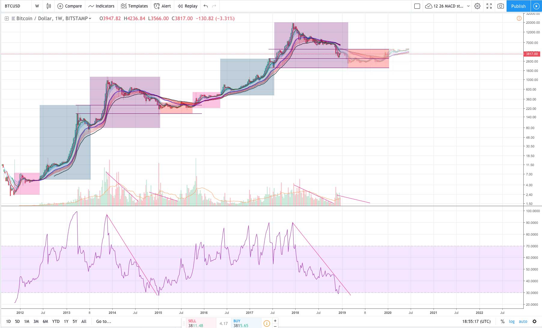
All that said, the most interesting thing about this pattern is how each cycle is comprised of noticeable sections.
I’ve color coded the sections above.
You have the pink section where the first breakout occurs and where the “luckiest” have accumulated their coins by, the blue section where the first round of excitement hits (historically it has been safe to enter here and HODL), and then the purple box of euphoria and doom where the last parabolic lift-off and then the subsequent bear market occurs.
In between this all, in the red section, we get an accumulation period in which media attention and hype dies down while “smart money” accumulates.
You can see in the chart above I’ve added some potential price action for 2019. The idea here isn’t to give targets, instead I simply copy and pasted the price action from 2015 onto 2019 to show what it might look like if the fractal played out. Please don’t interpret that as some mandate that we have to go up, down, or sideways.
Lastly, on the chart above you’ll notice I marked off some additional patterns. 1. Notice how the red box and blue box line up, it wasn’t like this in 2010 – 2011, was in 2012 – 2014, and we don’t know yet for 2016 – 2018, 2. Notice the pattern in volume and RSI. This seems to be repeating as well. In 2014 – 2015 the second time RSI reached 30 was the bottom. In 2018 we reached RSI 30 once. Will we reach it a second time in 2019 to form a bottom, thus creating a near perfect fractal? I don’t know, but will be interesting to watch.
NOTE: Below is the full chart from 2010 – 2018. The reason I didn’t analyze this one above is because zooming out like that makes some of the patterns harder to see (plus the volume is a little strange from this data set). Anyways, this does however clearly show the 3 fractals, each taking longer and longer to occur, each having a bigger accumulation period in between, and each being slightly less impressive looking on a logarithmic chart (which makes sense given how real dollar amounts are represented on a logarithmic chart despite what John McAfee might assert). Still, is this overall pattern pointing at a 4th fractal, I think the logic is there… but again, I can’t see the future.

BTC fractal 2010 – 2018
Author: Thomas DeMichele
Thomas DeMichele has been working in the cryptocurrency information space since 2015 when CryptocurrencyFacts.com was created. He has contributed to MakerDAO, Alpha Bot (the number one crypto bot on Discord),...
Thomas DeMichele's Full Bio